Corsair Gaming
The branding + identity refresh for the computer peripherals and hardware company.
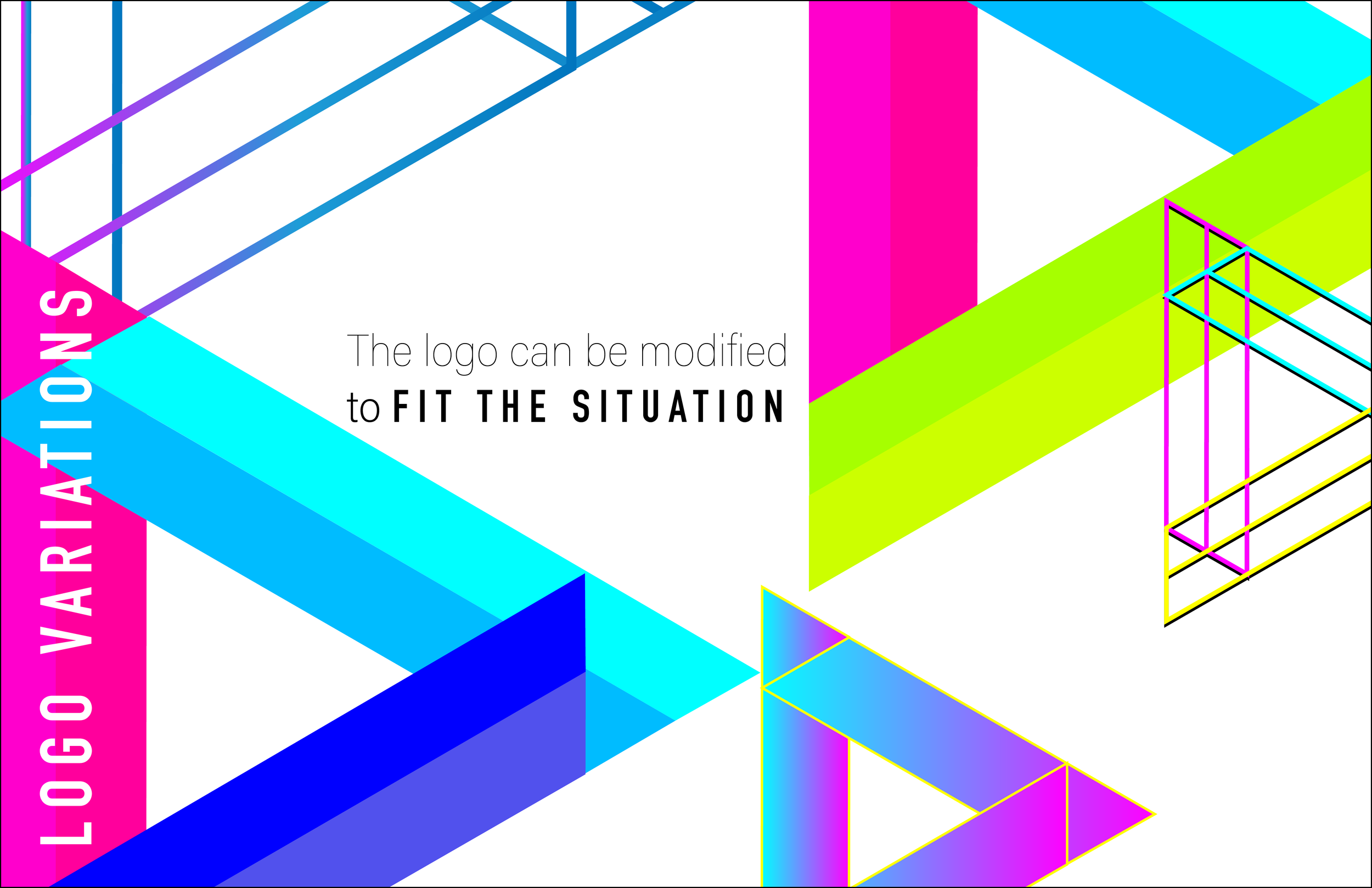
ANGULAR. INTRICATE. RHYTHMIC. ENERGETIC.
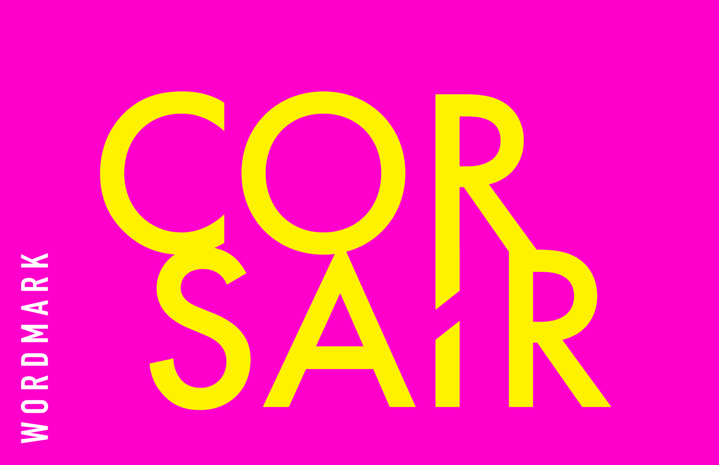
Refreshed brand + identity. Created brand guidelines. Redesigned logo and wordmark. Designed ads and print collateral. Designed dielines for packaging, with original art. Created a library of unique patterns to be used across a variety of touch points. Designed environment graphics.